SparkBot Marketing
December 2023 - Present: Current Project
2 Person Team: CEO & UX Designer
My Role: UX Designer
The Client
SparkBot Marketing is an agency that works with small to medium sized businesses to help improve their digital marketing efforts. On their homepage, they boast that they are “dedicated to helping brave entrepreneurs achieve their mission statement, and craft conversion-driving digital experiences designed to ignite the spirit of their businesses”
The Challenge
I was tasked with the objective of giving SparkBot’s desktop website a fresh-coat of paint: update the UI and UX to give the website a refreshed feel.
We started by empathizing with the user: potential clients who are small to medium sized business owners.
Research and Planning
I started by creating a user persona of potential SparkBot Clients. Based on previous clients and basic research of small business owners, I came up with the user persona, “Janet”.
From here, I created a user journey map for Janet on how she would navigate through the SparkBot website. I wanted to get a feel for how someone like her would go through a marketing agency’s website, and use that information to guide website edits:
User Persona created for SparkBot Marketing
User Journey Map Created for Janet
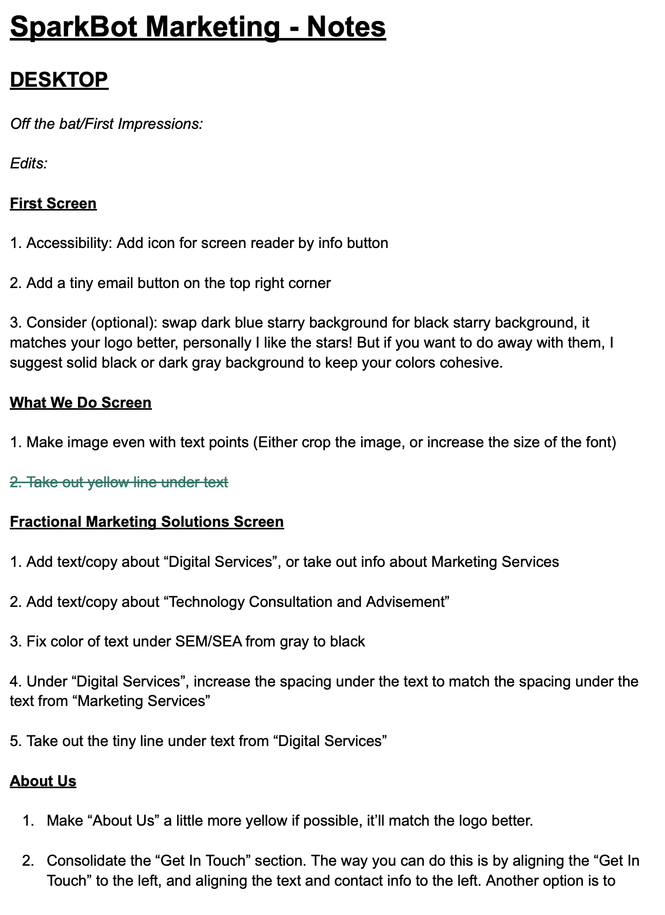
Taking all of this into consideration, I wrote out a list of potential changes I wanted to make to the homepage of the website. I used Google Docs to keep my thoughts organized and easy to share with the CEO.
Preliminary notes for website edits
Designing the Solution
Based on our research, I prioritized a few key changes:
1. Ensuring that the colors all matched well within the website design
To start this process, I created a design system in Figma with SparkBot’s logo colors. While creating this design system, I also added other digital assets and UI features to keep track of what typefaces, font sizes, and other features were being used to stay organized:
Design System for SparkBot Marketing Website
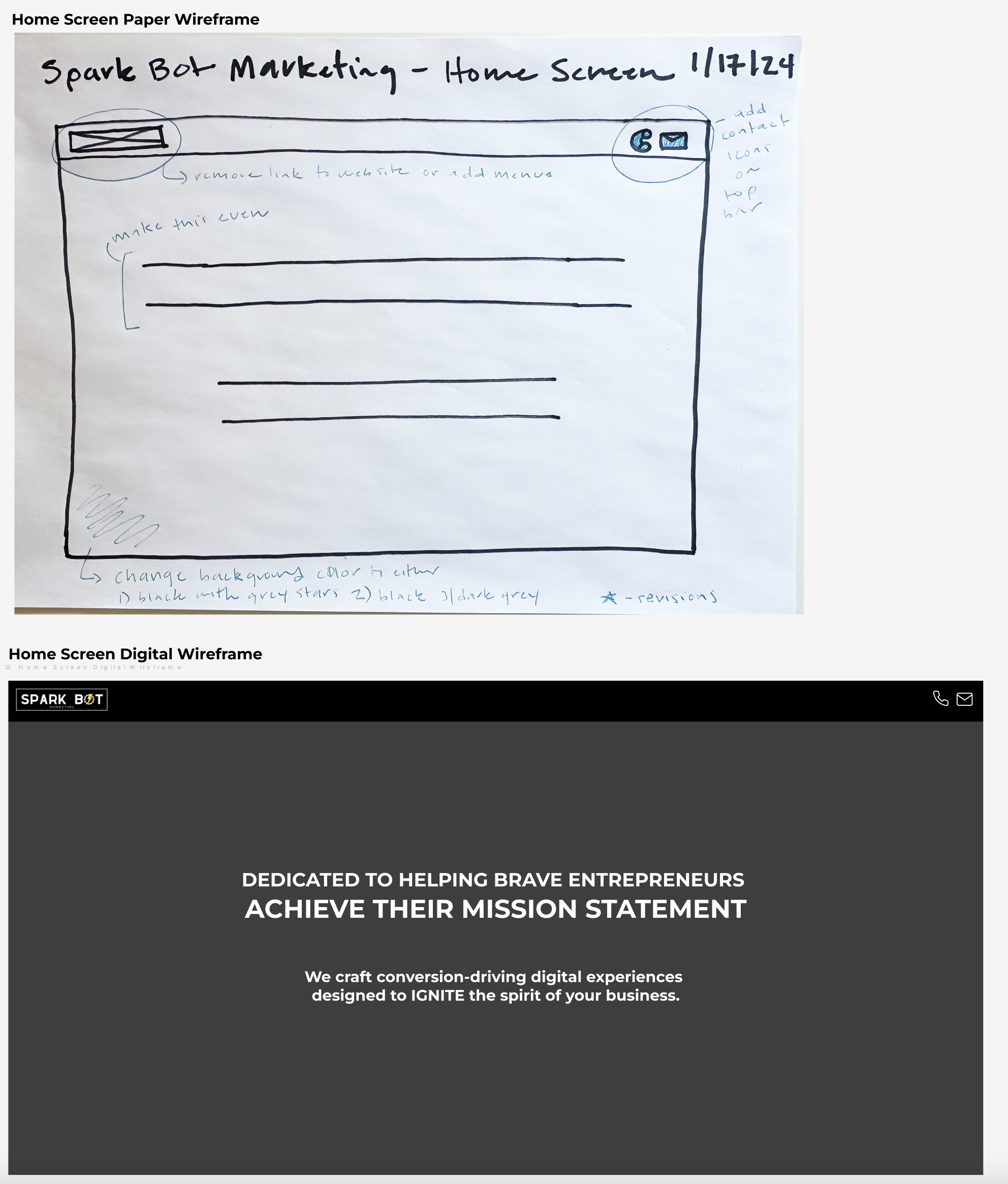
Doing this inspired me to swap out the background they had for the landing page above the fold. I liked the idea that they had with incorporating stars in the background for an adventurous feel, but felt the dark blue sky in the current background didn’t match well within the design system. So I found a new, black and white starry background and swapped it out for the blue background to keep the color scheme consistent.
Home Screen Wireframe: Paper + Digital
Digital Wireframes created in Figma: Before + After
Home Screen Wireframe with matching stars added
2. Making sure no copy was missing in any section
Reading through the website, I noticed a few sections were missing copy. I requested definitions for services provided by SparkBot to make sure that future clients of theirs knew exactly how they could grow their marketing efforts with SparkBot. While many business owners might have foundational knowledge on digital marketing terms, others might not.
3. Incorporating personal touches by replacing stock images with images from SparkBot’s clients
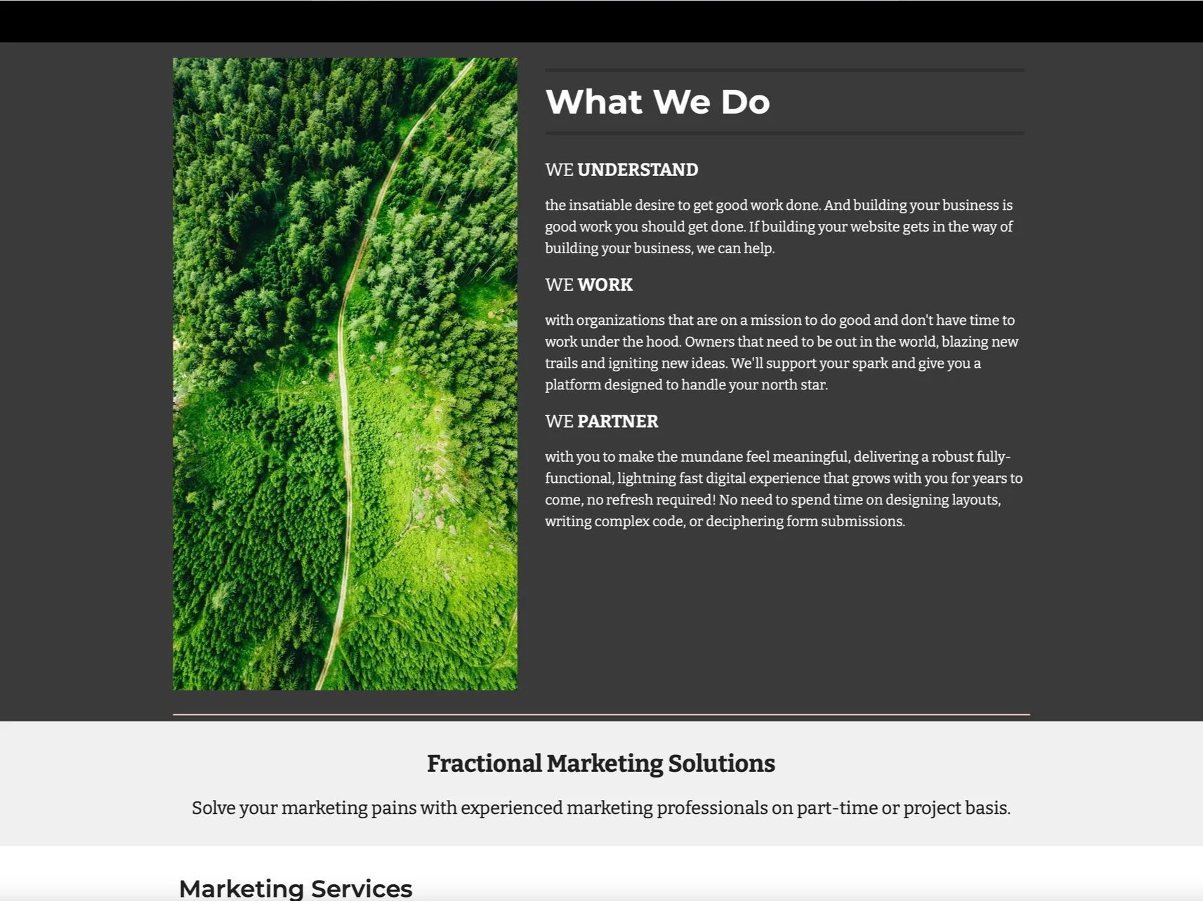
Of the features we implemented, this one was my favorite. I noticed on first glance that there was a stock image of a river on the website in the “What We Do” section. While it was a pretty picture, I felt it didn’t really speak to SparkBot’s mission, didn’t fit their color scheme, and could use an update with more relevant images.
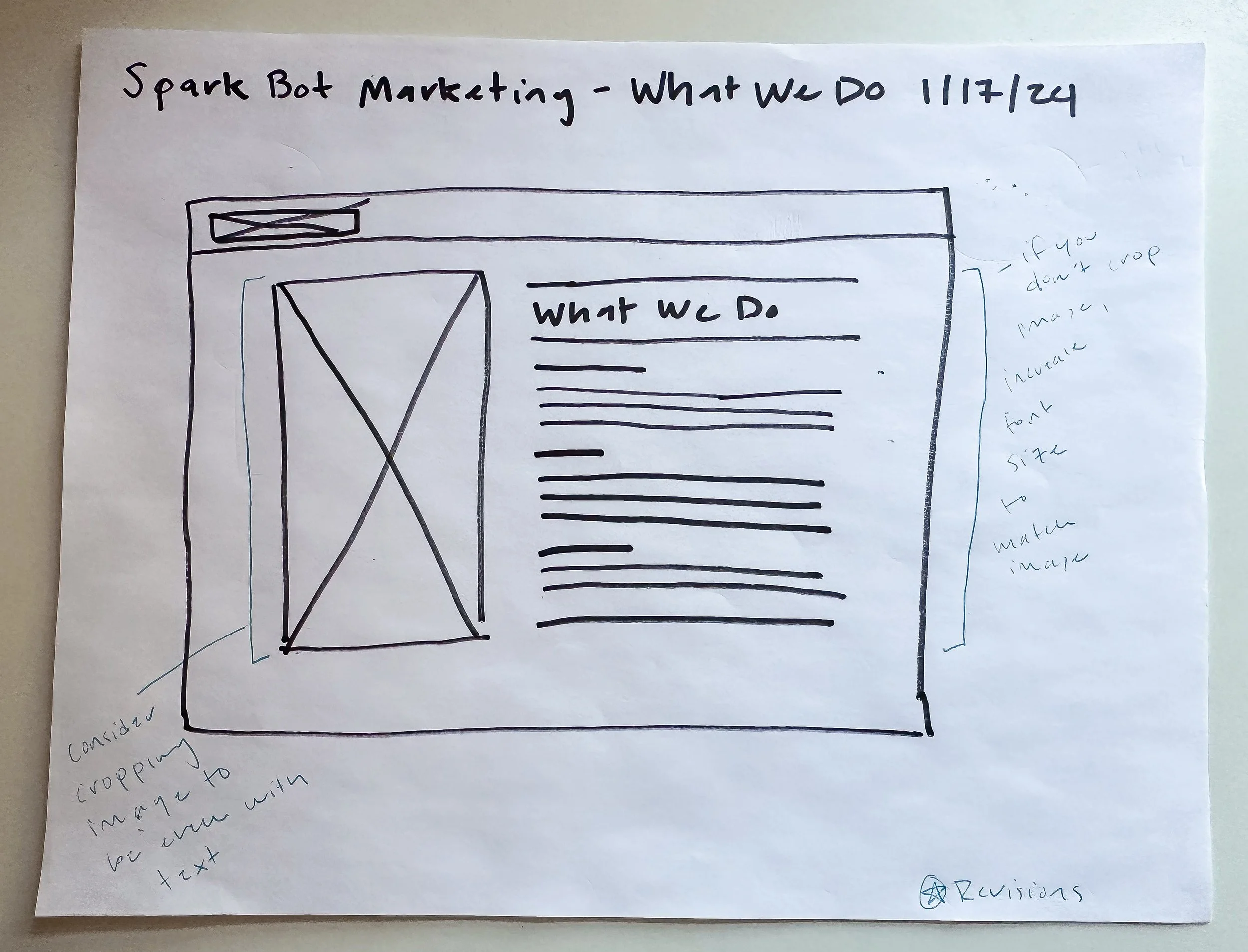
Paper Wireframe of “What We Do”
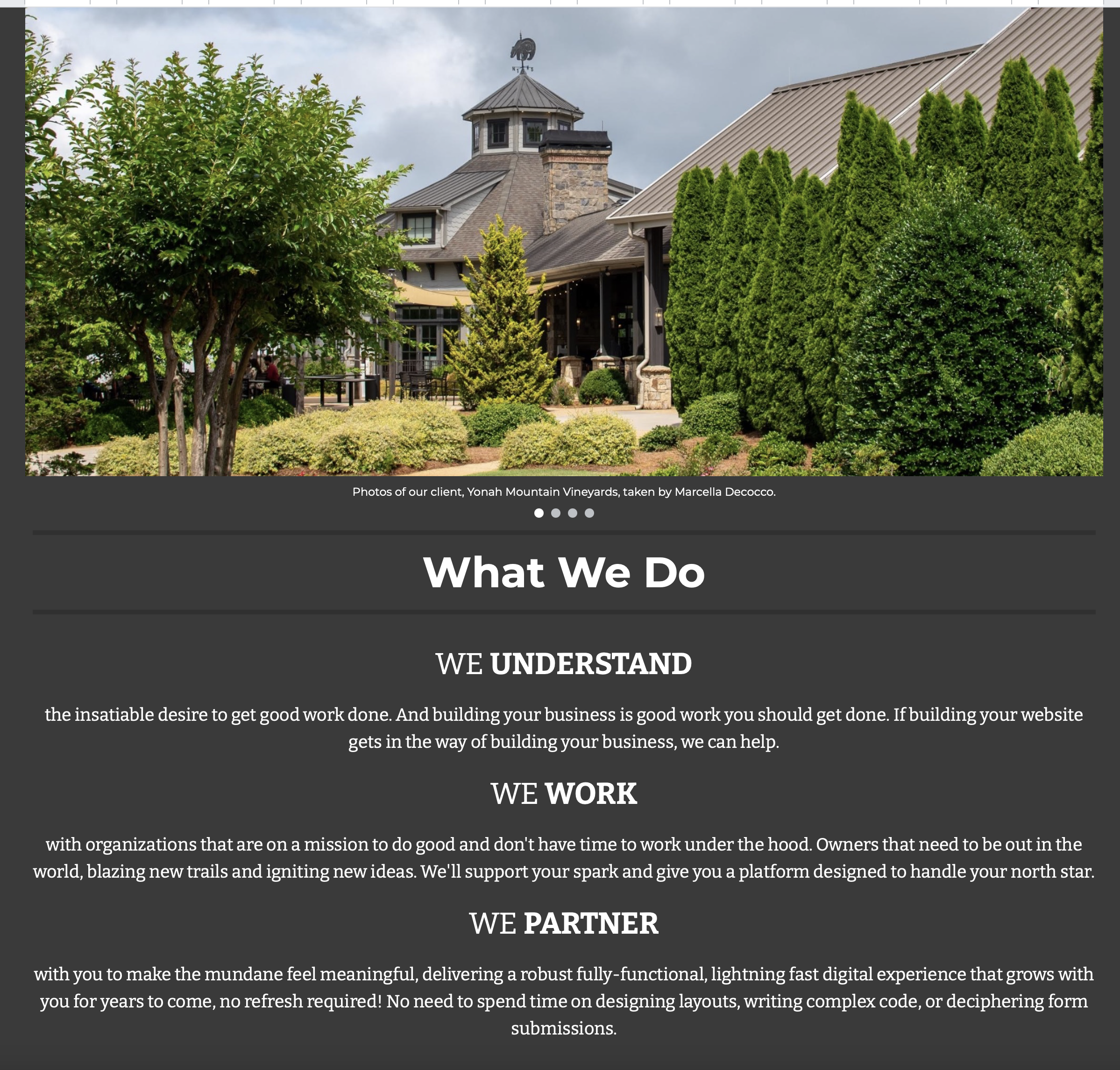
So, I swapped out this picture with a rotating carousel of images from SparkBot’s actual clients. To me, this felt more personal and inviting for future SparkBot clients to look at, and made their website feel a little more approachable. I also reformatted the copy to give it a bolder impact.
“What We Do” Screen before revisions
“What We Do” section with revisions
Conclusion
While this is still an active project of mine, here’s what I am hoping to accomplish, as well as other things I would do differently moving forward in future UX roles and projects:
1. Lead with making iterations based on more in-depth UX research
2. Construct site maps and information architecture for a foundation to build on as the website expands as the client’s company grows
3. Experiment with UI changes, such as color scheme and typefaces
This is my first UX project, and I am grateful for the opportunity to work with a great client like SparkBot. Moving forward with this project, and in new roles, I would like to focus more effort and time on performing more UX research tasks, such as competitive audit reports, usability tests, etc. I would also like to delve deeper into the process of how a user moves through a website and app: constructing user flows, reworking outdated information architecture, etc.
With that said, I have spoken with the client, and they have moved forward with a majority of the UI changes I suggested for their desktop website. I look forward to seeing how this project will evolve, and to their continued success in their future endeavors.
